RASC Calgary Centre - Colour Mag
Colour Mag
by Jason Nishyama
Page last updated November 5, 2018
Build your own Colour-Magnitude diagram
The Hertzsprung-Russel (H-R) diagram (Figure 1) is one of the foundations of our understanding of
stellar evolution. It is from the H-R diagram we get terms such as main sequence for stars that
live along the line running from upper left to lower right. These stars are the ones currently
fusing hydrogen into helium in their cores and are middle aged, like the Sun. Further to the upper
right are the red giants, stars that have used up their hydrogen fuel and are entering their last
stages of life and to the lower left where the white dwarfs are. The white dwarfs being the
remaining exposed cores of stars like the Sun after blowing off their outer atmospheres in their
final death throes.
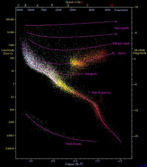
Credit: Richard Powell - Wikimedia Commons
The H-R diagram is also useful for studying star clusters. By determining the point where stars
begin to curve over to the giant phase (main sequence turn off), one can determine the age of the
cluster. Further the H-R diagram provides a method for determining the distance to the cluster,
since the main sequence provides a standard candle for the cluster.
In this project you won't be making an H-R diagram but a colour-magnitude (C-M) diagram. The two
will show the exact same visual data plot so are siblings. The difference is that the H-R diagram
has temperature plotted against luminosity whereas the C-M diagram has colour index plotted
against magnitude. Since colour index is directly related to temperature and magnitude to
luminosity, a C-M diagram provides basically the same information as an H-R diagram, but because
simple photometry can be used, is easier to make.
It is possible to do this project in one of two ways. You can simply get the magnitude information
for a cluster from an on-line source such as SIMBAD. You can also gather the information yourself
using a DSLR/CCD imager and a telescope. The latter is can be more rewarding as I find it's always
cooler to use one's own data to do science!
If you're going to do this the internet way, feel free to skip over how to collect the data and
get to the number crunching at the end. To do this using your own data you will need a telescope
with a driven equatorial mount, an imager, either a DSLR or CCD. This can be either a one-shot
colour imager or a monochrome imager. If you are using a monochrome imager you will also need at
least two colour filters, ideally Johnson's B and V but photographic B (blue) and G (green) will
work just as well for our little project. You will also need software that can do aperture
photometry such as Maxim DL or MPO Canopus. Since I'm cheap I use the IRAF package which is free,
but since it was made for professionals by professionals it has a steep learning curve and no
graphical interface.
So step one of this project is to choose a target cluster. To start I'd recommend a loose open
cluster as it is quicker to do the CCD-photometry for a smaller number of stars. For this example
I chose the open cluster M29 in Cygnus since it is relatively sparse and at the time I collected
the data, high overhead.
Once a target cluster has been selected, you'll need to image the cluster. As part of that imaging
process it is very important to take dark and flat frames as you'll need them later. If you have a
one shot colour imager or DSLR, take a few images of your target cluster at the integration
(exposure) that seems to bring out most of the stars in the image. If you have a monochrome imager
you will of course have to repeat this for each filter you use. For M29 I used two-10 minute
exposures for each filter then stacked them after processing darks and flats.
Once you have your images it's time to do the data reduction at the computer. I will give general
directions as each software package will do the same jobs in a different way. For example in IRAF
I first have to average together the darks, subtract that average from the flat frames (and
science frames) and then average the flat frames, using that average flat to flatten the science
images. In Maxim DL, all one has to do is give a list of the dark and flat frames and the software
does the rest. You'll need to read your software's documentation on how to handle darks and
flats.
If you used a one-shot colour imager or DSLR, have your software split the images (darks and flats
as well) into their component red, green and blue images. Since a one-shot colour imager/DSLR
already has a filter mask, it has already done the filtering for you (in photographic R, G and B).
In this case you'll want to use the R (red) frame and the B (blue) frame since the filter mask
used by the imager has 2 green pixels to every one red and blue pixel. Thus the green image will
appear twice as bright as the red and blue images. Once everything has been separated into their
different colours, process for the appropriate dark and flat frames. If you have taken more than
one science image, stack them to get more stars.
Naturally if you are using a monochrome imager with filters, simply process for dark and flat
frames and stack the images if more than one image was taken for each filter. For monochrome
imagers you can use any two of the photographic filters (or if you've spent the $$$ for Johnson
filters, use the B and V).
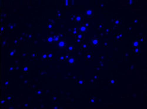
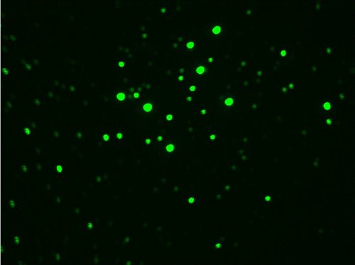
Now you should have two images, each in a different colour filter band. I used photographic B and
G since they correspond closest to the Johnson B and V filters. That provided the images in
figures 2 and 3.
Now select the stars for photometry. The more the merrier. I used 50 from M29. At this point you
will definitely need to read your software's manual on how to do photometry. In IRAF I had to
register the images, that is rotate and stretch them to line all the stars up from one filter
image to the next. Then I had to determine the position of each star in terms of the x and y
coordinates of the image. Those coordinates were then fed into the IRAF code to do the photometry.
Other software may simply let you point the mouse cursor at a star and click to do the same thing.
The main important thing here is that your magnitudes from one colour image match up to the same
stars in the other colour image.
You should now have a list of magnitudes for each star through each of your two filters. If you've
decided to do this as an armchair project, welcome back and you should have similar information on
the stars in your cluster from the internet. At this point if we were looking at publishing our
data we would have to do a bunch more processing to convert our instrumental magnitudes (the
magnitudes we measured) to standard magnitudes (what would normally be reported in a star
catalogue). Of course if you're doing this as an armchair project, you'll have the standard
magnitudes. We would also want to correct our magnitudes for extinction and reddening as caused by
interstellar dust and gas. We'll look at doing this in a future project, but for now just using
the raw instrumental magnitudes will do fine.
Now you will need to create the colour index. This is normally done by the pros by subtracting the
V magnitude from the B magnitude for each star. For the one-shot imagers/DSLR's you'll subtract
the R from the B and monochrome imagers the redder filter from the bluer filter. I used B and G
filters so I'll subtract G from B.
Once this is done you simply plot each star on an x-y graph (manually or using a spreadsheet or
graphing software) with the colour index on the x axis and one of the single filter magnitudes (I
used the G filter, but either will do). You want the colour index numbers to increase from left to
right, so further right equals a more red star. You want the magnitudes numbers on they y axis to
decrease as they go up so that stars get brighter as you go up the graph. For M29 I ended up with
the graph in figure 4:

The bars that extend from some of the points are error bars showing that for the fainter stars,
the exact magnitude is more unknown than for the brighter stars, who's error bars are so small
they are hidden by the point.
So what does this graph tell us? Well there what appears to be a main sequence turn off (figure 5)
near one end of the main sequence. If we were to convert the instrumental magnitudes to standard
magnitudes we could use this to determine the age of the cluster. Since the turn off is near the
upper left end of the main sequence we can deduce, however, that this cluster is quite young.
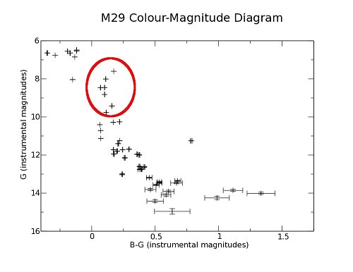
There are some stars in what appears to be odd places. At the top left and bottom right (figure
6). One would assume that if there is a main sequence turn off that there would be no stars above
that. It would appear that M29 has stars beyond the turn off. This could be due to a couple of
factors. First, the errant stars could simply be field stars between us and the cluster, though
why they'd all just happen to be hot blue stars makes this unlikely. Second is that though we
assume that all the stars in the cluster were formed at roughly the same time. This is a fair
enough assumption but since this cluster is quite young, it is possible that these blue stars are
simply younger than the stars that are beginning to move off the main sequence.
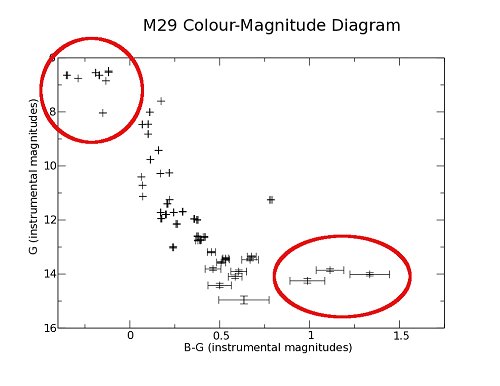
At the other end we have a few stars that seem to be slipping to the right of the main sequence.
There are a couple of factors that could account for this as well. First the error bars are quite
large due to how dim the stars are so they could actually be closer to the main sequence than the
diagram suggest. Another possibility is that if you look at figure 1, the main sequence does seem
to level off a bit in the middle, and thus we could be looking at this middle portion, with the
cooler stars being to dim to be imaged with the given exposure. They of course could also just be
field stars that were picked up in the boundaries of the cluster.
Your cluster's C-M diagram will look different if you use a different cluster. Try this out with a
few clusters and look a the differences. One thing to look for is where the main sequence turn off
is. The further to the right the turn off, the older the cluster. In a future project we'll look
at how to make the diagram more accurate by converting to standard magnitudes and accounting for
extinction and reddening. Until then happy observing!
|

